iOS Control Center: Too Much Whitespace, Too Little Functionality 00:26, Jan 12, 2017
It has room for improvement, literally.
I saw this neat Verge video on Instagram about extending battery life on phones.
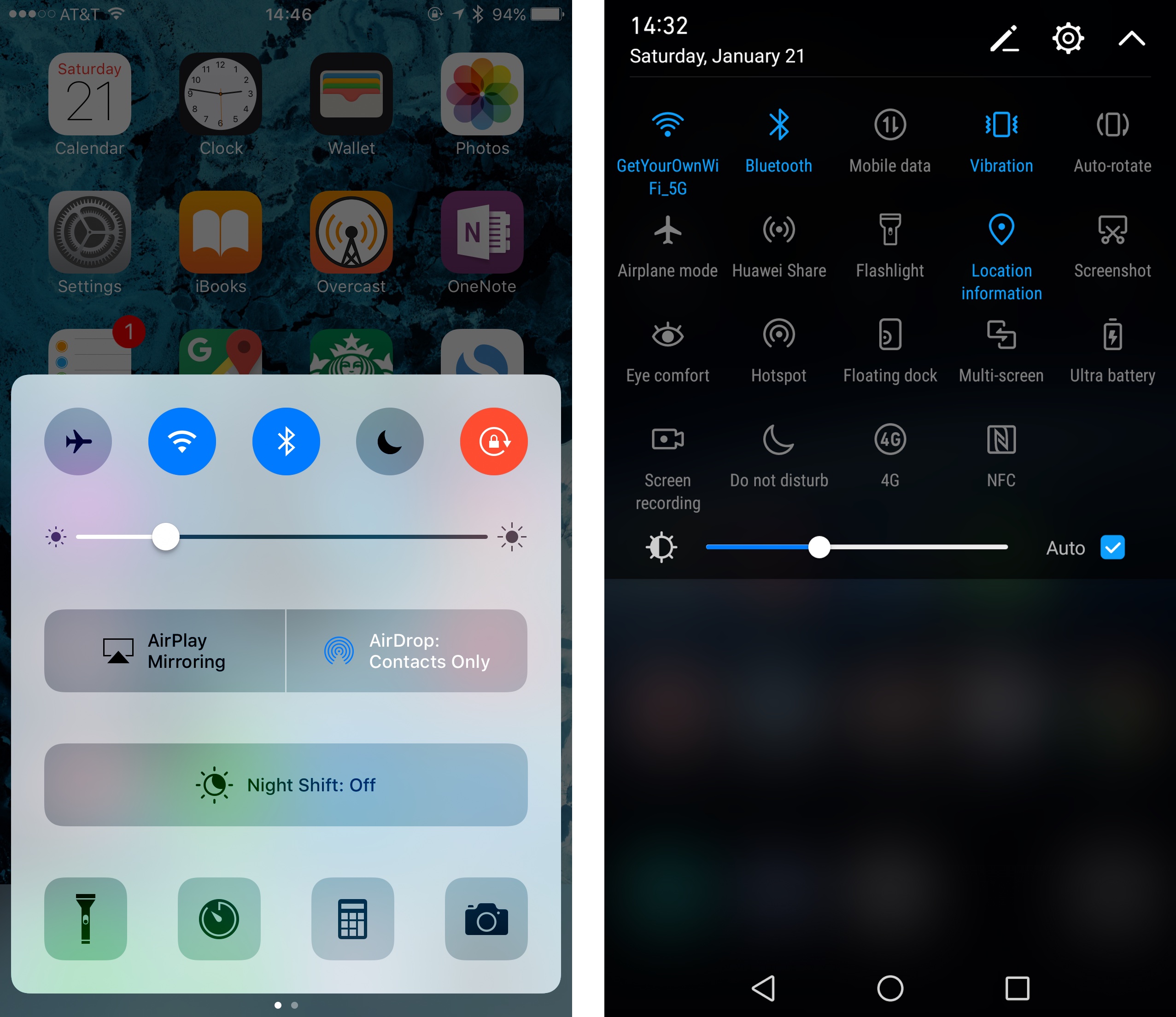
What struck me about this video is how many steps it takes to turn some settings on/off on iOS, compared to Android, where such actions mostly take a swipe and a tap and from a common location. Isn't Control Center supposed to make such actions quick? But take a look at the screenshot below:

Comparison between iPhone 7 Plus and Huawei Mate 9.
The left one is from my 5.5-inch iPhone 7 Plus, the right one is from my 5.9-inch Huawei Mate 9. The Control Center takes a similar amount of screen space as the quick settings on the Huawei, but offers a drastically smaller number of options. It's mishmash of UI elements is also baffling.
On iOS, toggling mobile data, auto brightness, WiFi hotspot and power saving mode, arguably common actions by a technically literate user, requires finding and opening the Settings app on iOS (which doesn't even have a shortcut in Control Center) and then digging several layers deep, while toggles for AirDrop, AirPlay and Night Shift(Really?) takes space that could fit 10 toggles. It does not make much sense.
It is okay for Apple to put these settings here, but they should not take up so much space. Right now, they seem to be taking space because they need text labels and Apple wants whitespace around them. But why? The smaller, tighter text labels on the Huawei are completely legible on a 5.5-inch screen. Rather than focusing on making Control Center look nice (and failing even this part), Apple should really focus on information density here.