The Trap of Direct Manipulation 19:56, Apr 19, 2018
Moving objects around the screen is no longer enough for mobile productivity.
Has anyone ever tried setting a custom wallpaper on an iPhone or iPad?
If that wallpaper has something that needs to be centered, doing it on an iOS device is a pain. The eyes are not exactly accurate measuring tools, and even if your eyeballing capability is accurate enough, your hand might not be able to catch up to it.
Check this out:

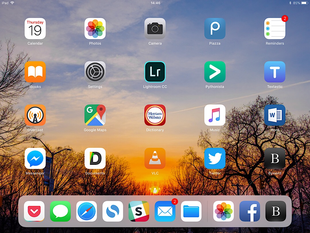
My best effort to center my sunset photo.
I attempted this several times but still you can see that the sun is not really centered. It is a bit to the right of the middle of the three navigation dots above the dock, which indicates the real center line.
I blame this on unaided direct manipulation.
Direct manipulation is often deemed "good" UI design because it is intuitive. However, without proper computer aid it introduces the inaccuracies of our analogue body mechanics into an otherwise much higher-precision system. The combined result can be jarring, such as the manually centered wallpaper and programmatically centered UI elements. We might not be good at eyeballing distances, but we are damned good at spotting misalignments.
This problem is especially severe in the mobile era because of two reasons: the ambiguity of touch targets and the omission of precision controls. The former is inherent: our fingers are not mouse pointers, after all. The latter, however, is a design problem.
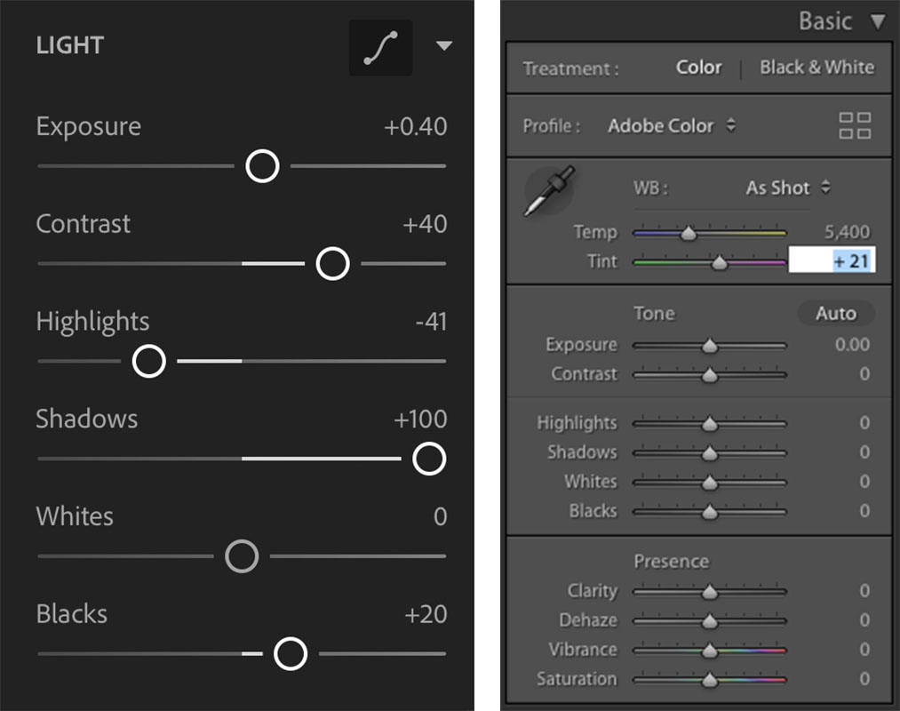
Contrast Lightroom Mobile with Lightroom Classic, for instance.

Lightroom Mobile on the left; Lightroom Classic on the right. Note the handy text box in Classic that the Mobile version could also use.
Lightroom Mobile is kind enough to give you a numeric value to the adjustments, but it might as well not, because it's almost impossible to find-tune them down to the digit. On the desktop, you can click on the values and directly edit them. It's not direct manipulation, but it gives you the precision you need. And if you ever tried changing white balance in Lightroom, you'll know that you do need that.
Mobile has seemed like such a great opportunity to make the dream of direct manipulation everywhere come true: We are interacting with objects directly on the screen. It would seem that on mobile direct manipulation would allow us to do everything we want. Plus, there wasn't much space on the screen to begin with, and the trend is making minimalism interfaces, right?
But that was early days, when processing power was limited and the tasks were simple. 10+ years after the original iPhone we (or at least Apple) are talking about replacing computers with iPads. But unaided direct manipulation will not provide the precision and consistency that "real" work will continue to demand, and until app designers put more back more controls to allow for precision inputs, mobile will continue to lag in the productivity department. After all, most of us have stopped hand drawing charts for a reason.