iPad Pro 10.5 Review 02:09, Jul 07, 2017
An iPad, yet the best one ever.
I got my iPad Pro 10.5, which replaced my iPad Air 2, about two weeks ago, along with a Smart Keyboard. Here's how have I felt so far.
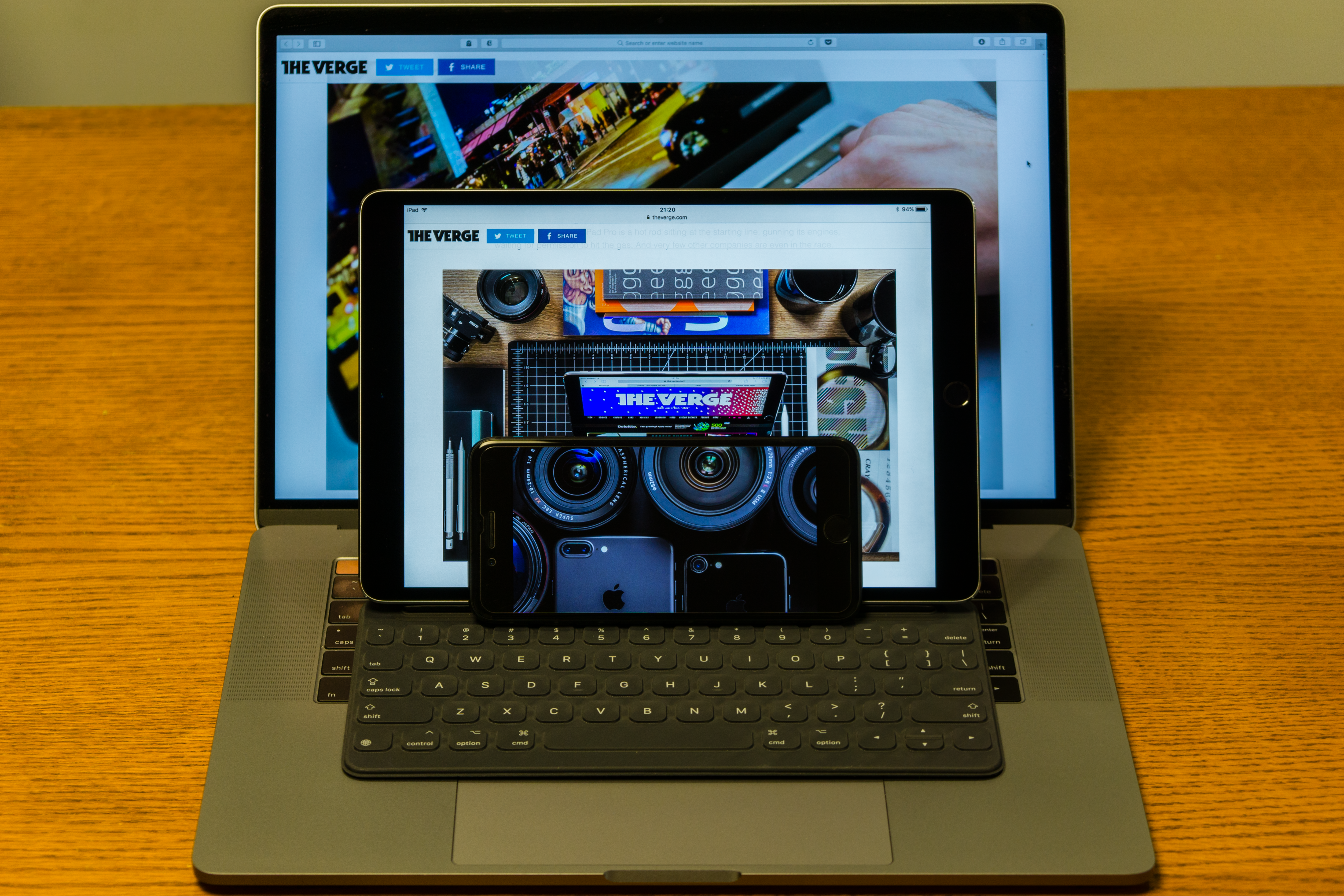
A size comparison.
Hardware
- This is, obviously, the best iPad ever, but more so than in previous years.
- It is significantly faster and more fluid.
- The 120Hz refresh rate is great.
- In old news: TrueTone is very, very nice, as are the four speakers.
- The new thinner bezels did not feel much narrower to me, until I looked at my Air 2.
- I haven't used the camera much, but with the rest of the interface being so fluid, I wish the camera preview had a higher refresh rate.
- The Smart Keyboard takes quite a bit of getting used to, and is much inferior to the new MacBook Pro's keyboard. Once I got used to it, however, typing is fast.
- Some symbol keys on the Smart Keyboard are shrunk, especially the right bracket, plus, minus and pipe/slash, which makes it less than ideal for coding.
- This is old news, but the iPad Pro + Smart Keyboard combo cannot replace the "lap" part of your laptop.
iOS 11
I jumped on iOS 11 immediately after the public beta became available for obvious reasons. In iOS terms, iOS 11 is amazing, which is why I need to talk about the general OS and the multitasking part separately.
General OS

Marking up a set of screenshots in iOS 11.
- iOS 11 feels significantly faster on this iPad than on the iPad Air 2.
- The new dock is great, both in the increased number of icons and the ability to hold a few recent applications. In comparison, the Springboard is simply stupid.
- Cmd+Shift+4 now brings up the screenshot markup interface directly, which is a huge step-up from even macOS.
- Taking multiple screenshots in quick succession will add several screenshots to the lower-left "dock", tapping on which brings up a gallery-like interface with each screenshot available for markup. Neat.
- The swipe-for-special-characters feature on the new soft keyboard is a godsend.
- But auto-capitalization of the first letter of a sentence with a hardware keyboard attached is quite stupid.
- You can now view your keychain credentials in the Settings app, which authenticates you by TouchID. One more thing that makes the iPad feel less like a satellite device to the Mac. I love this.
- "Markup as PDF" seems to be a system-wide action now, which I love and is a step ahead of macOS.
- Drag-and-drop, as it is currently implemented, conflicts with the old long-press actions a bit as a long press also begins the drag-and-drop process if you are not careful.
Multitasking
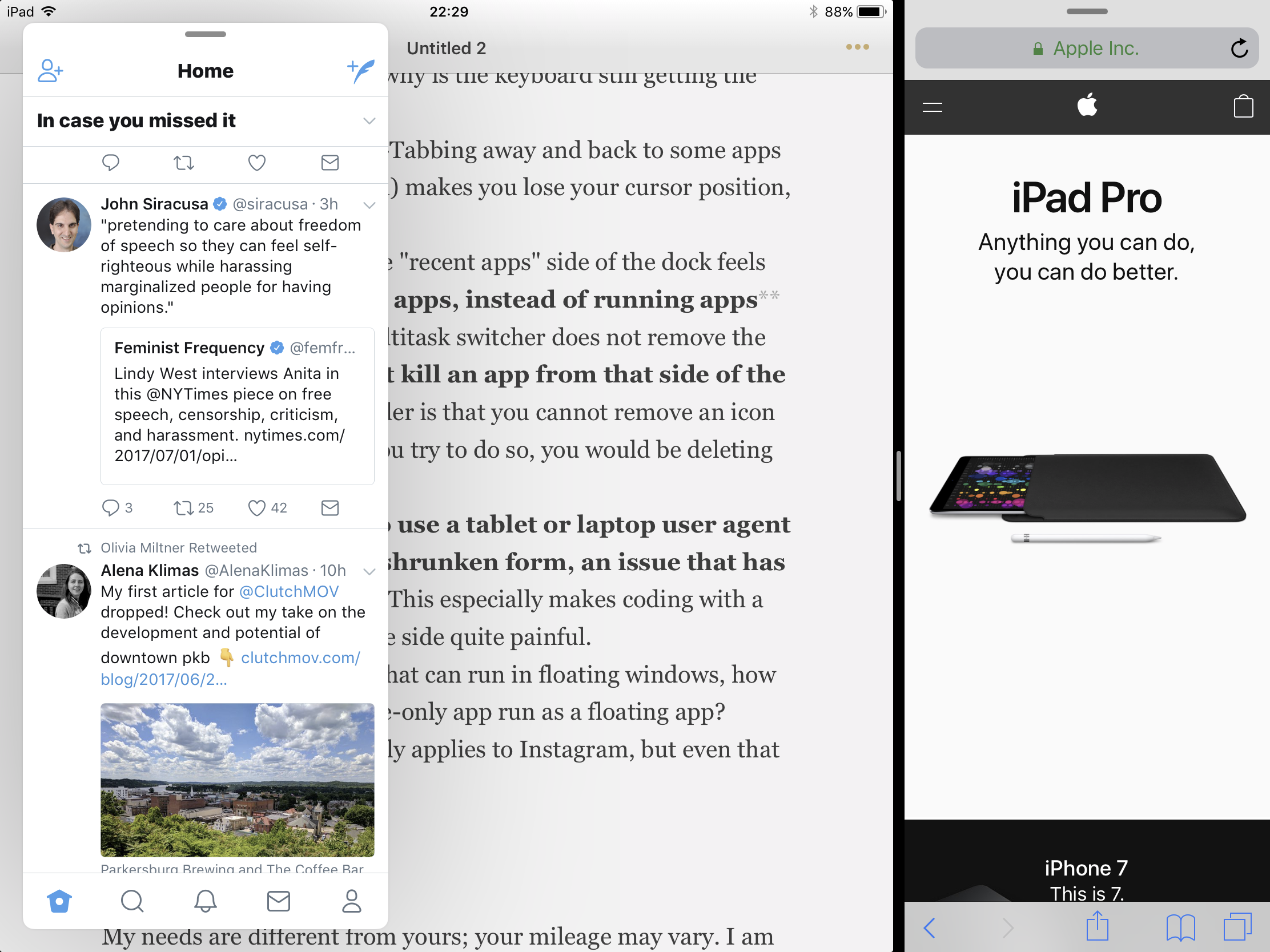
Three windows on screen at once.
- Multitasking is greatly improved from iOS 10: you can have the side-by-side plus the pop-out video plus the floating app.
- Swiping up from the bottom of the screen with an app running feels haphazard, especially with the Smart Keyboard attached, given the narrow bezel's approximity to the numbers row and the fact that the bottom of the screen is usually something keyboard-related, such as auto-suggestions. I wish there is a keyboard shortcut to bring up the dock.
- Adding an app to the multitasking mode requires the user to press the app icon on a dock for a split-second to initiate a drag, which slows down things quite a bit.
- Speaking of keyboard shortcuts, I wish there are keyboard shortcuts for summoning/dismissing the "docked" app, summoning/dismissing the floating app and cycling between the split ratios of the side-by-side apps, since it's fixed ratios for now anyway.
- The new multitask switcher, I mean the double-tap Home button one, is great, but why is the keyboard still getting the Alt-Tab icon version?
- Speaking of Alt-Tab, Alt-Tabbing away and back to some apps (Coda, I'm looking at you) makes you lose your cursor position, which is again a pain.
- Coming from macOS, the "recent apps" side of the dock feels odd. It shows recent apps, instead of running apps (killing an app in the multitask switcher does not remove the icon), and you cannot kill an app from that side of the dock. What's even odder is that you cannot remove an icon from that area; should you try to do so, you would be deleting the app.
- Safari still seems to use a tablet or laptop user agent when it is used in its shrunken form, an issue that has existed since iOS 9. This especially makes coding with a Stack Overflow tab on the side quite painful.
- Now that we have apps that can run in floating windows, how about allowing an iPhone-only app run as a floating app? Granted this basically only applies to Instagram, but even that would be nice.
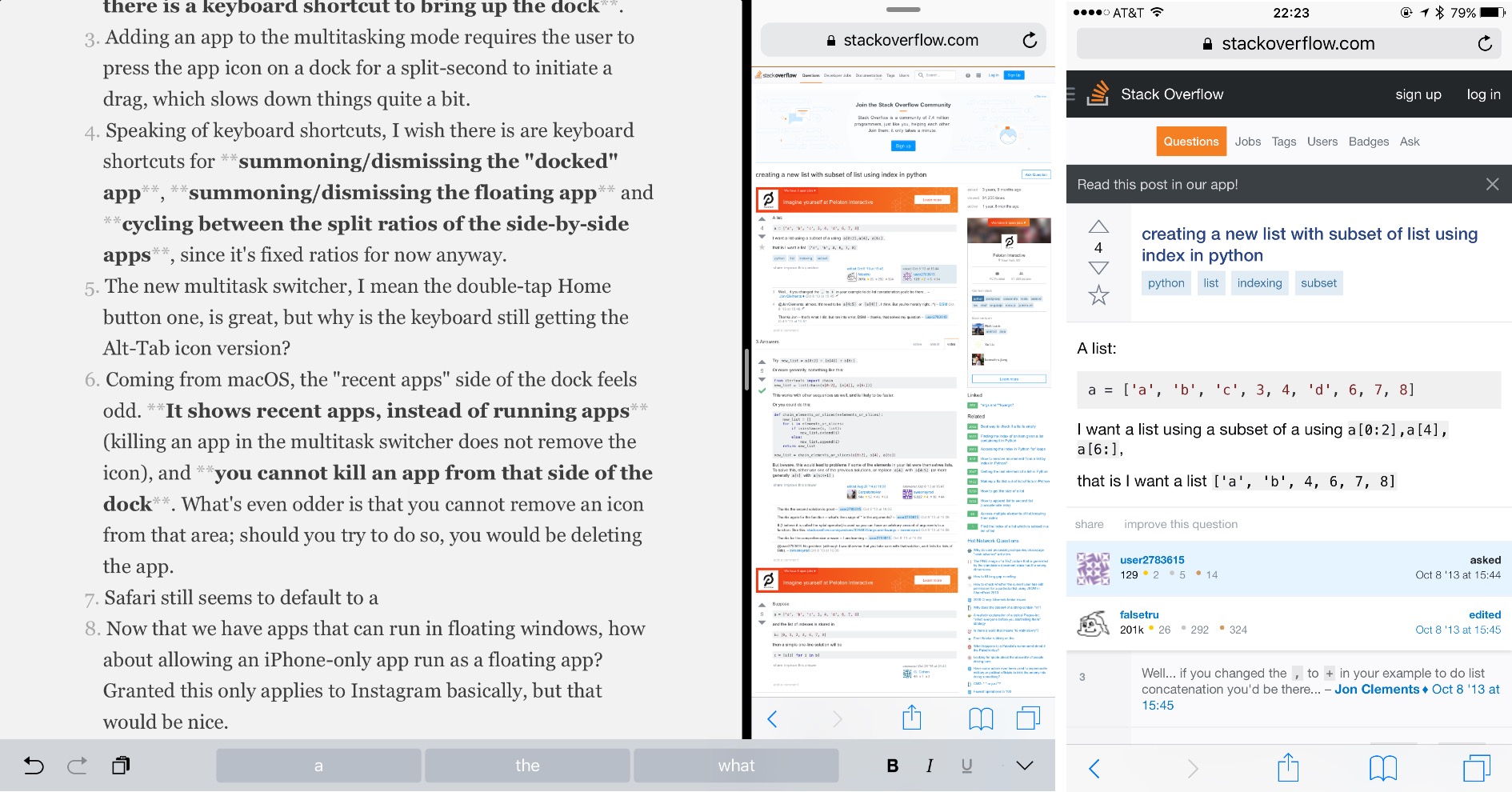
iPad on the left, iPhone 7 Plus on the right. Note how the same Stack Overflow page is rendered differently.
Doing work
My needs are different from yours; your mileage may vary. I am currently a data journalism intern at Financial Planning; in normal school time, I am a student of journalism and computer science; in my spare time, I try to improve my photography. Here's how the iPad Pro has been performing for my use case.
Writing things
- For casual or distraction-free writing, I use Byword, which I have always liked and found no problems with.
- Office on this iPad Pro requires an Office 365 subscription for full functionality, but the apps are quite great.
- In normal school year, I need to write problem sets in LaTeX, which I haven't yet found a good way to do on iPad. None of the existing apps (of which there aren't many) are good enough to my taste, and I dislike using a Web app for that.
Using the web
- Safari on the iPad still exists in an odd position between a phone browser and a desktop browser. Some Web apps, such as the Outlook Webmail, give me a horrible "light" version that frustratingly, cannot be switched to the full-functionality desktop version.
- If sites load properly, they work mostly fine, including even my publication's CMS, which is a pleasant surprise.
- I'm not sure when iOS added this, but at least since iOS 8 uploading files in Safari has been possible (judging from the podcasts I hear, Apple pundits don't remember when, either). With the new Files app this should be even better, as you don't have to shuffle apps into some "document providers" to upload them anymore.
- I wish Safari had the same kind of reliability that desktop browsers have: no matter how much stuff I open after I switch away from the browser, the windows should not lose their state. My work computer has 4GB of RAM and it runs Windows 7 with a spinning HDD, yet I can (mostly) trust what I have in Chrome on that thing to not get lost more than on this iPad, which also has 4GB of RAM.
Data work
- Pythonista is as great as it always has been. It includes
csv, which can be used for simple data work. Performance is fine. - What Pythonista does not have is
pandas; nor is there a way to run a Jupyter Notebook. - Neither available on the iPad is a native way to run SQL. Combined with the lack of support for
pandas, it is nigh impossible to do any moderately large scale data analysis involving multiple tables. - The iPad version of Excel actually supports sorting and filters, which is more than what I asked for. It seems that creating a pivot table is not possible, although interacting with an existing one is, which is an odd decision on Microsoft's part.
Web development
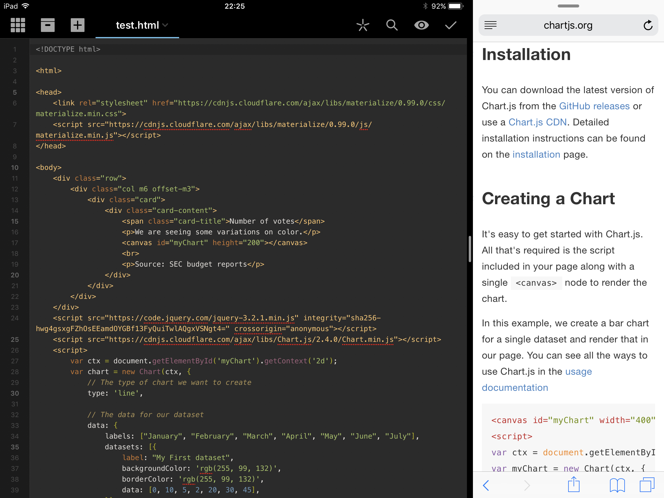
Developing a quick webpage in Coda with documentation on the side.
- Due to the programming situation, developing, say, this website, is not possible on this iPad.
- Pure HTML+JavaScript+CSS development is good enough with Coda, but iOS can really benefit from some decent ways to view source, inspect elements and use a JavaScript console. (Coda gives you an "script error" whenever something is wrong with your code, which is extremely helpful)
- One quick note: by default, typing quote marks on iOS gives you curly "matching" quotes, which will give you some "script error" in JavaScript. Go into Settings to turn it off if you want to write code. (Settings -> General -> Keyboard -> turn off "Smart Punctuation")
Photo editing
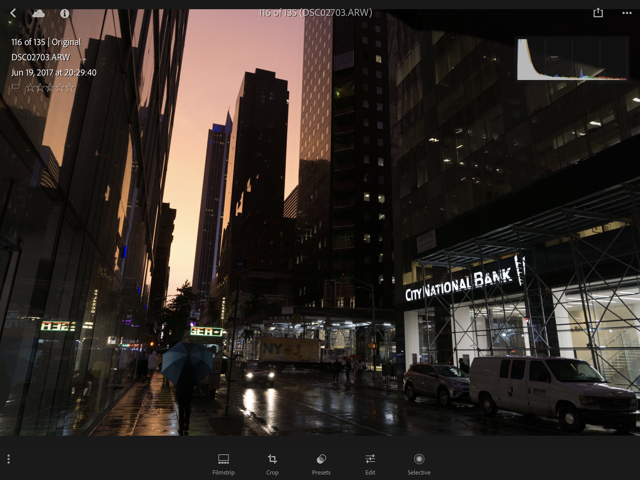
All the "info" I can find about this photo in Lightroom.
- It is quite amazing to go out with an iPad, a Lightning to SD card adapter and a camera. If you are in the field, editing photos on an iPad is much nicer than on a laptop because you don't even need to break out the keyboard. And it's way lighter.
- Working with a bunch of RAW files, however, is a huge pain. You have to import it into Photos; then you import it into whatever app you are using. Then when you are done, you need to delete them from that app and Photos.
- I don't know what app is good for processing RAW files, so I default to Lightroom. But the iPad version of Lightroom is simplified in ways unnecessary. For example, there are presets for noise reduction, but more granular controls for that do not exist in the editing part of the app. EXIF data of photos is also nowhere to be found. Since most tools in Lightroom is quite well-compartmentalized, why not just bring them to the iPad? And somehow, deleting photos from collections do not delete them from Lightroom itself.
So what changed, compared to my iPad Air 2?
Not much, especially after the Air 2 got iOS 9. Everything is nicer and faster, but in terms of capability, the iPad Pro does not gain much over the Air 2, especially after discounting the Pencil factor.
You can have a few more windows on the screen, sure, but it only makes things that you could do on the Air 2 nicer, rather than unlocking new capabilities. An extra window does not give iPad multitasking a quantum jump, especially when it cannot be pinned permanently. Drag-and-drop is great in theory, but I wonder if a developer did not bother to take advantage of the extension system to work with files, how support for drag-and-drop will be any different.
What the iPad gained in iOS 9 and iOS 11 are more windows for the same iPad things. But more windows are not a direct path to more productivity. I can use my MacBook in full-screen mode full-time and get all my work done, because a lack of windows can be worked around with a bit more tapping and clicking. But a lack of, say, ability to install data processing libraries cannot be worked around.
So the iPad Pro, even with iOS 11, does not cross the line that separated previous iPad productivity and traditional laptop productivity. It will continue to be amazing for iPad users and continue to be frustrating for Mac or Windows users, as it always has been.
Fortunately, I have used a bit of both before this one. And this is the best iPad yet, by a mile. So, I love this iPad.