A Second Perspective:
Living with the iPhone 7 Plus's Dual Cameras

A story for my personal blog.

Harry (Tiancheng) Zhang

tz2309 <at> columbia.edu

Spring 2018

Multiplatform Design & Storytelling

#brand

A simple logo that works at various sizes.

  • The brand is a take on my initials, H.Z., since I am working on my personal blog
  • The icon is a morph of the two letters
  • The hope is to create something simple, iconic, yet intepretable.

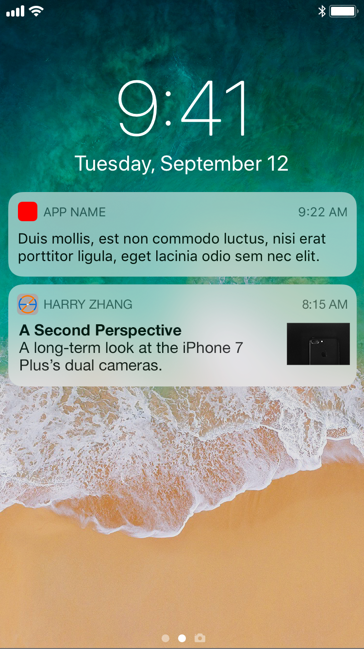
The push notification

On Twitter

On Instagram

I happen to be writing my story largely based on what I post to (one of) my Instagram account(s), so a natural fit is to tell my admittedly small audience about where the photos they see are coming from.

On the big screen

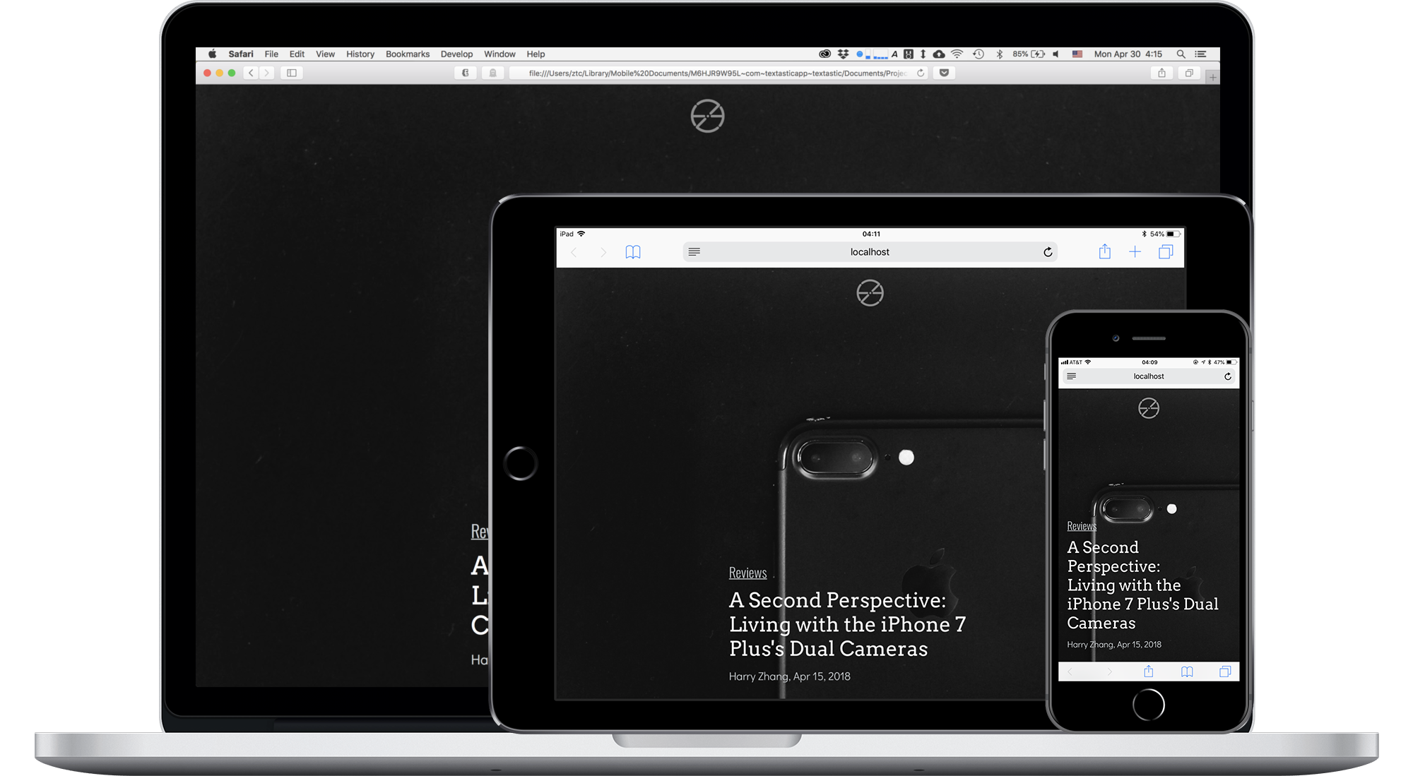
Linear storytelling could use some fun on the desktop. What if I put narrations next to the photos, but keep the overall flow intact? I experimented with this idea, and it came out relatively well. You can see the full story below -- just scroll it!

On the small screen

The magic of responsible design enables me to make one page that does well on both desktop and mobile. Here, I tap into the familiar camera interface itself, using the "1x" and "2x" zoom buttons in the iPhone camera app to tell the reader which photo came from which camera.

You can see the full story on the right -- just scroll it!

Thank you!